I can’t be alone. Among the thousands of pro-716 “BuffaLOVERS”, I think many of us have an unexplained affinity for the standing buffalo. An odd choice for a favorite animal, sure. Especially for one that has no confirmed credit for the city of Buffalo’s name. But yet it’s slapped all over everything we love, from sports teams to street landscapes. So of course when Karen and I moved to the city, we immediately needed to adorn our new house with the burly image.
Enter New Buffalo Graphics, the standing buffalo capital of Buffalo.
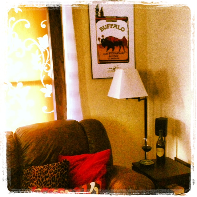
The first piece that caught my eye looked like a pack of camel cigarettes. Closer inspection revealed creative detail with a purpose unrelated to smoking altogether. References to camel were replaced by buffalo both in writing and graphically. Cigarettes became clarinets and the subhead of Jazz & Geography Blend Clarinets brought it all together.

But what’s better is how those elements came about.
I inquired with Hertel Avenue shop owner and designer, Michael Morgulis (who I note is a former award winning Ad Club member), about his inspiration for this wildly interesting piece, and also (politely) demanded an explanation on how it related to Buffalo. He was happy to oblige, and went on to tell me about his days in the late 70s and early 80s where he would develop posters for the Just Buffalo Literary Center. Each poster announced an event, usually a poetry reading or other literary happening. In this case, poets and musicians from many geographical points around the country were coming to perform in Buffalo. It was sort of a rock concert, but with poetry and jazz.
He went on to tell me how the stars aligned at the 11th hour.
“So, there I was trying to meet deadline, up all night, drinking coffee and smoking one Camel after another, struggling to come up with the right combination of words and images. And then it was time to take my daughter to the Community Music School for her clarinet lesson. As usual, she complained that I smelled bad from smoking so much. So, I decided the only right thing to do was to listen to the wisdom and quit smoking then and there. All at once the elements of that moment coalesced. The sun came out from behind the clouds, the air was clear and I knew that the clarinet/cigarette rhyme and the “make music, not smoke” message was going to somehow be on the 17×22 piece of paper on my drawing board. I crumpled the pack of Camels with 3 cigarettes left, meaning to dump it forever… and then, in a double-take, uncrumpled the package, flattened it out and looked at it in an all new way.
I finished the poster in time and never went back to smoking. It was 1985.”
28 years later, it’s in my living room.

Let em be among the first to comment — welcome to blogging. Both fun to do and yet just one more obligation! Nice story on the background of the Morgulis poster. It had always been one of his posters that made me stop and think, “Why cigarettes?” It was me that nominated Michael for the Ad Club’s Osborn award so many years ago. He’s a stalwart in the creative community and we’re better off for him having shared his talents. If Buffalo’s creative imagery has a signature style, many would think of Michael’s work first.
LikeLike
Even though I consider myself an “almost-Buffalonian” right now, I’m already falling in love with Buffalo-themed decor. Especially when there’s a great story attached. 🙂
I also approve of the random wine bottle and glass on your end table!
LikeLike
Thanks! And yes, for every Buffalo related piece we have in our house, there’s just as many wine related!
LikeLike
I just bought this poster at an estate sale in atlanta, ga…love it!!
LikeLike